

GIS in Databricks
Introduction
The topic of Geographic Information Systems (GIS), finds its way into the data analytics arena all too often without much consideration of how to implement it within big data solutions. In many contexts GIS data is large! Due to it comprising many layers of spatial information. This makes it tricky to deal with. Although there are libraries available such as GeoPandas, to help with geospatial operations, they’re often not scalable when dealing with copious amounts of data. Many big data projects that require GIS call upon external software tools to handle the data. Commercial tools such as ArcGIS, can come at a hefty additional expense.
Is there a way to integrate GIS into the current data engineering pipeline one may have, without relying on external tools? The answer is yes! Databricks, a popular big data tool that is powered by a powerful Spark engine, has released a GIS tool named ‘Mosaic’. It aims to bring performance and scalability to design architectures. This also paves the way for any geospatial-related ML or AI that is desired alongside any ETL. This article is going to discuss how to use Mosaic and give people a flavour of the sort of use cases you may want to explore.
Mosaic
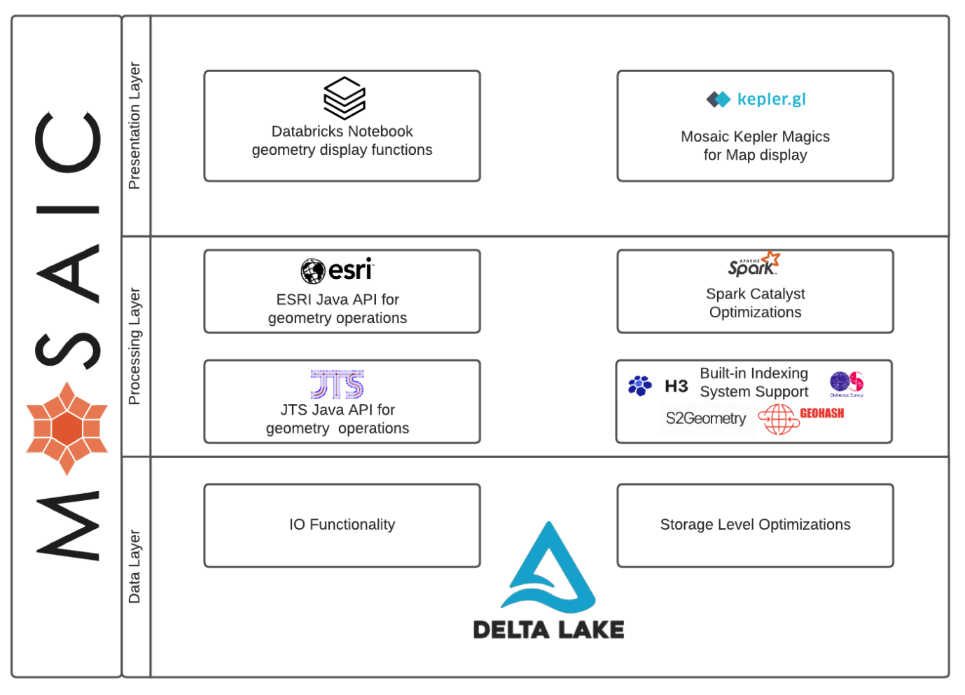
Mosaic works as an extension of the Apache Spark framework. Written in Scala to guarantee performance, it provides wrappers to support common languages such as Python, R and SQL. It simplifies the geospatial operations, allowing for a range of geospatial encodings such as WKT, WKB and GeoJSON (more to come soon). It also facilitates easy conversion to geometries such as JTS Topology Suite (JTS) and Environmental Systems Research Institute (Esri). All whilst leveraging the power of Spark. Finally, for a complete developer experience, Mosaic provides easy wrappers for visualisation through Kepler GL integration.
Kepler is a powerful geospatial analysis tool, making for very convenient inline code visualisations. It can also display H3 grids, a useful spatial index system used within Mosaic.

H3
H3 is a grid indexing system, originally developed by Uber as a Discrete Global Grid System (DGGS). In other words, it utilises hexagonal shapes that form a grid globally across a map. Hexagons naturally tessellate, making it a useful grid system for passing information and providing high accuracy. H3 comes with 16 resolutions to pick from. Each H3 cell ID consists of an integer (or string). Generating cell IDs as integers allows the Mosaic to take advantage of Delta Lakes Z-ordering, making for highly optimised storage.
Use Cases
With such promising capabilities, it is nessaccary to demonstrate these in relatable business use cases. The examples shown below are a limited selection of the kind of ways Mosaic can be used to deliver revenue-generating projects.
Taxi Activity Density
A use case that is similar to school building density calls upon the well-known New York taxi data. The link to the raw data can be found here. Alternatively, the dataset is included within Azure Databricks and can be found in the mounted dataset directory on the Databricks workspace. Additionally to this, police precinct polygon data was used. This should be downloaded as a csv file. The objective is to generate a density map showing what precinct areas had the most taxi activity throughout the year. This requires determining which precinct regions the taxi pickup and dropoff points land. Focusing on the first week of 2016, the yellow taxi data alone has approximately 2.3M journies. This requires the use of distributed computing to handle this large amount of data. Mosaic combined with Databricks is the perfect tool for such a task.
The first step is to process the precinct data. This needs to be loaded in and have the geometry (Well-known text) converted into a Mosaic geometry. Once in Mosaic geometry form, the command ‘grid_tessellateexplode’ allows for tessellation of the polygon areas, using H3 coordinates as well as doing the explode operation, freeing up further information. This information includes each H3 index and wkb chips for plotting. The reason for doing this will become apparent later. There are now polygons comprising of tessellating H3 coordinates, where the polygon lines go through H3 coordinates at the boundary.

The command for doing this is shown here.
crimeDF = (
    spark.read.format("csv")
    .option("header", True)
    .load("dbfs:*load path*")
    .withColumn("geometry", mos.st_geomfromwkt("the_geom"))
    .withColumn("mosaic_index", mos.grid_tessellateexplode(col("geometry"), lit(8)))
    .drop("the_geom")
)
The next step is to tidy up the taxi data so that it can be used effectively. Assuming the data is already loaded into a Dataframe, it can be processed using the code below.
taxis = (
    taxis.withColumnRenamed("vendor_name", "vendor_id")
    .withColumn("pickup_datetime", from_unixtime(unix_timestamp(col("pickup_datetime"))))
    .withColumn("dropoff_datetime", from_unixtime(unix_timestamp(col("dropoff_datetime"))))
    .withColumnRenamed("store_and_fwd_flag", "store_and_forward")
    .withColumnRenamed("rate_code", "rate_code_id")
    .withColumn("dropoff_latitude", col("dropoff_latitude").cast(DoubleType()))
    .withColumn("dropoff_longitude", col("dropoff_longitude").cast(DoubleType()))
    .withColumn("pickup_latitude", col("pickup_latitude").cast(DoubleType()))
    .withColumn("pickup_longitude", col("pickup_longitude").cast(DoubleType()))
    .withColumn("passener_count", col("Passenger_Count").cast(IntegerType()))
    .withColumn("trip_distance", col("trip_distance").cast(DoubleType()))
    .withColumn("fare_amount", col("fare_amount").cast(DoubleType()))
    .withColumn("extra", col("surcharge").cast(DoubleType()))
    .withColumn("mta_tax", col("mta_tax").cast(DoubleType()))
    .withColumn("tip_amount", col("tip_amount").cast(DoubleType()))
    .withColumn("tolls_amount", col("tolls_amount").cast(DoubleType()))
    .withColumn("total_amount", col("total_amount").cast(DoubleType()))
    .withColumn("payment_type", col("Payment_Type"))
    .withColumn("pickup_year", year("pickup_datetime"))
    .select(
        ["vendor_id", "pickup_year", "pickup_datetime", "dropoff_datetime",
            "store_and_forward", "rate_code_id", "pickup_longitude", "pickup_latitude",
            "dropoff_longitude", "dropoff_latitude", "passener_count", "trip_distance",
            "fare_amount","extra", "mta_tax", "tip_amount", "tolls_amount","total_amount",
            "payment_type",
        ]
    )
)
The taxi data then needs to be manipulated to consider pickup and dropoff coordinates as locations that could be included within each precinct. The pickup and dropoff points also need to be converted to an H3 grid index. The purpose of this is to simplify the operations. Due to the large amounts of data needed to be considered, reducing the resolution on the map will provide huge benefits. A resolution of 8 is chosen for this and the coordinates are converted to H3 indexes. This is done using the grid_longlatascellid command. Each location point is now assigned to an H3 index of resolution 8, simplifying the problem. In addition to this, the coordinates for each pickup and dropoff point should be converted to a Mosaic geometry. The reason for doing this will be expressed later. The coordinates can be converted to a Mosaic point using ‘st_point’.
pnts = (
taxis.withColumn(
"points", mos.grid_longlatascellid("pickup_longitude", "pickup_latitude", lit(8))
)
.withColumn(
"geom", mos.st_astext(mos.st_point(col("pickup_longitude"), col("pickup_latitude")))
)
.withColumnRenamed("pickup_longitude", "longitude")
.withColumnRenamed("pickup_latitude", "latitude")
.select("points", "longitude", "latitude", "geom")
).union(
(
taxis.withColumn(
"points", mos.grid_longlatascellid("dropoff_longitude", "dropoff_latitude", lit(8))
)
.withColumn(
"geom", mos.st_astext(mos.st_point(col("dropoff_longitude"), col("dropoff_latitude")))
)
.withColumnRenamed("dropoff_longitude", "longitude")
.withColumnRenamed("dropoff_latitude", "latitude")
.select("points", "longitude", "latitude", "geom")
)
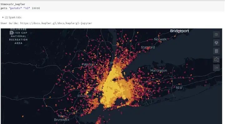
)Using a simple group by, the density can be plotted.
pnts = pnts.groupBy('points').agg({'geom': 'count'}).withColumnRenamed('count(geom)', 'density')This data can be displayed using a Kepler command as shown below.
We now need to determine which of these coordinates belongs to which precinct. Since the data points and polygons have H3 coordinates assigned to each point and area, this allows for a fast effective join for all H3 indexes. This has been achieved due to using ‘grid_tessellateexplode’ earlier, exposing H3 indexes.
There is still a remaining issue that some H3 coordinates on the boundary of each precinct (polygon) will cross over into the neighbouring precinct. We now need to filter out H3 coordinates chips that are outside the boundaries of each polygon. An effective way to do this is to use an ‘or’ operation combined with the ‘is_core’ information available and the ‘st_contains’ command. The ‘is_core’ information comes from the ‘mosaic_index’ column, created from ‘grid_tessellateexplode’ earlier. It describes if each H3 index is complete within a polygon shape (core to the polygon). Using the condition ‘col(“mosaic_index.is_core”)’ is fast compared to using ‘st_contains’. Therefore, ‘col(“mosaic_index.is_core”)’ should come first. Finally, the remaining boundary chips should be filtered using ‘st_contains(col(“mosaic_index.wkb”)’. This will ensure that each wkb chip at the boundary is contained within the polygon.
plot_pnts = (
    pnts.join(crimeDF, crimeDF["mosaic_index.index_id"] == pnts["points"], how="left")
    .where(col("mosaic_index.is_core") | mos.st_contains(col("mosaic_index.wkb"), col("geom")))
    .withColumn("wkb", col("mosaic_index.wkb"))
    .select("wkb", "Precinct", "geom")
    .groupBy("wkb", "Precinct")
    .agg({"geom": "count"})
    .withColumnRenamed("count(geom)", "density")
)
Now the data is available, this can be visualised using Kepler. Using the command below will give you the appropriate plot.
%%mosaic_kepler
plot_pnts "wkb" "geometry" 100000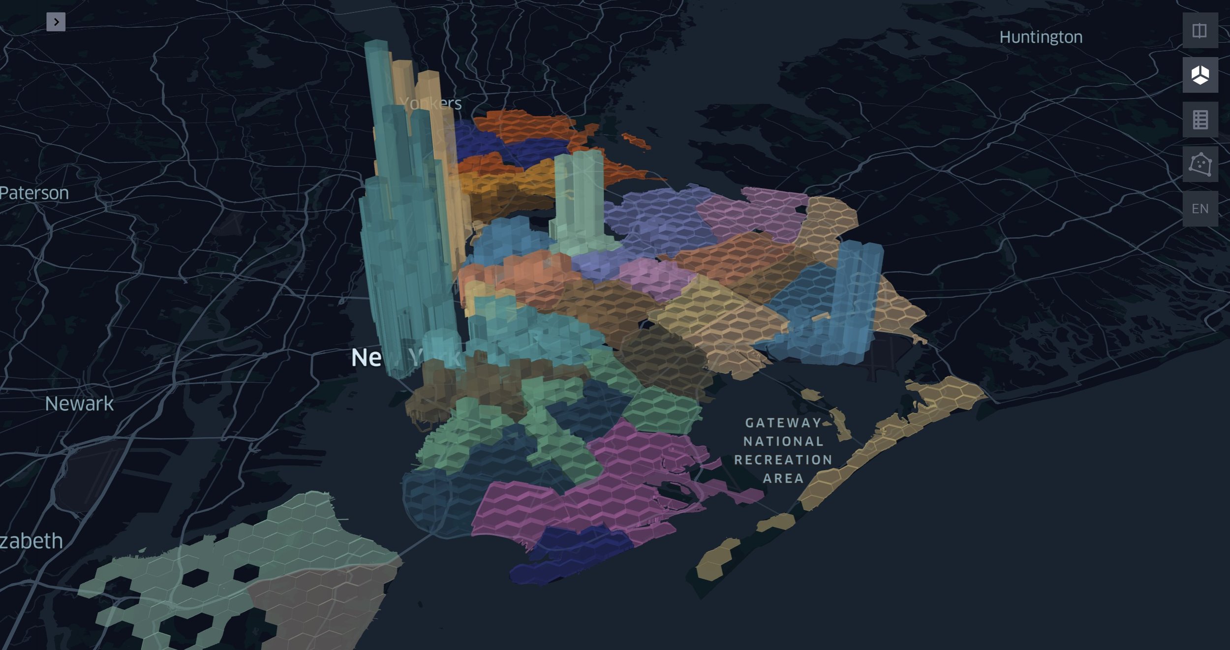
Observing the plot above, the H3 chips that are higher within the precincts, have higher taxi activity, in contrast to the lower H3 chips in each precinct that have less activity density. The precinct polygons are shown with variating colours.
School Building Density
It may be applicable to explore particular types of buildings within a region. Consider a use case where the user wants to explore how many schools are within an area. Using Mosaic combined with Databricks, large quantities of data can be extracted and manipulated with relative ease.
Consider picking the Greater London area to focus on. The data can be downloaded from Geofabrik. Note, if you already have building shapes data available you can skip this section and go to: “All Building”.
The appropriate information can be extracted from the file and fed into Delta Tables. The downloaded ‘.bz2’ files can have certain tags extracted from them using the ‘options(rowTag=*tag name*)’. The file downloaded is an XML file format which isn’t a natively recognised file to Databricks. Spark-xml needs to be installed on the cluster. Details of how to do this can be found here. The three tags that should be extracted are nodes, ways and relations. The schema for these three is given below:
from pyspark.sql.types import LongType, TimestampType, BooleanType, IntegerType, StringType, StructField, ArrayType, StructType, DoubleTypeid_field = StructField("_id", LongType(), True)common_fields = [
    StructField("_timestamp", TimestampType(), True),
    StructField("_visible", BooleanType(), True),
    StructField("_version", IntegerType(), True),
    StructField(
        "tag",
        ArrayType(
            StructType(
                [
                    StructField("_VALUE", StringType(), True),
                    StructField("_k", StringType(), True),
                    StructField("_v", StringType(), True),
                ]
            )
        ),
        True,
    ),
]nodes_schema = StructType(
    [
        id_field,
        StructField("_lat", DoubleType(), True),
        StructField("_lon", DoubleType(), True),
        *common_fields,
    ]
)ways_schema = StructType(
    [
        id_field,
        *common_fields,
        StructField(
            "nd",
            ArrayType(
                StructType(
                    [
                        StructField("_VALUE", StringType(), True),
                        StructField("_ref", LongType(), True),
                    ]
                )
            ),
            True,
        ),
    ]
)relations_schema = StructType(
    [
        id_field,
        *common_fields,
        StructField(
            "member",
            ArrayType(
                StructType(
                    [
                        StructField("_VALUE", StringType(), True),
                        StructField("_ref", LongType(), True),
                        StructField("_role", StringType(), True),
                        StructField("_type", StringType(), True),
                    ]
                )
            ),
            True,
        ),
    ]
)
Before nodes, ways and relations are extracted, the command below needs to be run to ensure the Mosaic library works correctly with Databricks. The data can now be extracted and stored in Delta tables. This also sets the default grid within Mosaic to H3 and the default geometry API to JTS.
import mosaic as mosmos.enable_mosaic(spark, dbutils)Once the nodes, ways and relations are stored within Delta tables, the next step is to get lines and polygons extracted. Firstly nodes columns are renamed.
nodes = (
    nodes
    .withColumnRenamed("_id", "ref")
    .withColumnRenamed("_lat", "lat")
    .withColumnRenamed("_lon", "lon")
    .select("ref", "lat", "lon")
    )
Next, the nodes need to be joined onto the ways. Mosaic can now be used to convert the longitude, latitude coordinates into Mosaic points which are then aggregated together and converted into Mosaic lines.
# Join ways with nodes to get lat and lon for each node
(
    ways.select(
        f.col("_id").alias("id"),
        f.col("_timestamp").alias("ts"),
        f.posexplode_outer("nd"),
    )
    .select("id", "ts", "pos", f.col("col._ref").alias("ref"))
    .join(nodes, "ref")
    # Collect an ordered list of points by way ID
    .withColumn("point", mos.st_point("lon", "lat"))
    .groupBy("id")
    .agg(f.collect_list(f.struct("pos", "point")).alias("points"))
    .withColumn(
        "points", f.expr("transform(sort_array(points), x -> x.point)")
    )
    # Make and validate line
    .withColumn("line", mos.st_makeline("points"))
    .withColumn("is_valid", mos.st_isvalid("line"))
    .drop("points")
)
The next phase is to extract the polygons from the data. For this we take the line data and join it to the relations data, extract ref, role and member type columns and filter some columns. The filters are applied to make sure the roles are only inner and outer roles. Similarly, the member types are only ‘ways’
line_roles = ["inner", "outer"]
relations_jn = relations.withColumnRenamed("_id", "id")
            .select("id", f.posexplode_outer("member"))
            .withColumn("ref", f.col("col._ref"))
            .withColumn("role", f.col("col._role"))
            .withColumn("member_type", f.col("col._type"))
            .drop("col")            # Only inner and outer roles from ways.
            .filter(f.col("role").isin(line_roles))
            .filter(f.col("member_type") == "way")
Now the data is ready for joining onto the lines. Within the data, lines are grouped together by ‘id’. This means they can be aggregated together to make polygons. One thing to remember is a polygon requires at least 3 vertices and a closing point. This will require filtering to remove anything that doesn’t fit these criteria. Polygons should also have exactly one outer line. Once this is done, the Mosaic library can be used to create a Mosaic polygon using ‘st_makepolygon’. The routines for doing this are shown below:
polygons = relations_jn.join(
      lines.select(f.col("id").alias("ref"), "line"), "ref")
      .drop("ref")
      # A valid polygon needs at least 3 vertices + a closing point
      .filter(f.size(f.col("line.boundary")[0]) >= 4)
      # Divide inner and outer lines
      .groupBy("id")
      .pivot("role", line_roles)
      .agg(f.collect_list("line"))
      # There should be exactly one outer line
      .filter(f.size("outer") == 1)
      .withColumn("outer", f.col("outer")[0])
      # Build the polygon
      .withColumn("polygon", mos.st_makepolygon("outer", "inner"))
      # check polygon validity
      .withColumn("is_valid", mos.st_isvalid("polygon"))
      # Drop extra columns
      .drop("inner", "outer")
Now that polygons have been extracted from the data, the final step is to produce building data. There are two types of buildings that can be collected from this data, simple buildings and complex buildings. Simple buildings come from the ways data whereas complex buildings come from the relations data and are made up of multipolygons. The following steps can deliver simple and complex polygons.
Simple buildings
building_tags = (ways
                .select(
                f.col("_id").alias("id"),
                f.explode_outer("tag")
                )
                .select(f.col("id"), f.col("col._k").alias("key"), f.col("col._v").alias("value"))
                .filter(f.col("key") == "building")
                )simple_b = lines.join(building_tags, "id")
                .withColumnRenamed("value", "building")
                # A valid polygon needs at least 3 vertices + a closing point
                .filter(f.size(f.col("line.boundary")[0]) >= 4)
                # Build the polygon
                .withColumn("polygon", mos.st_makepolygon("line"))
                .withColumn("is_valid", mos.st_isvalid("polygon"))
                .drop("line", "key")
                )
Complex buildings
keys_of_interes = ["type", "building"]relation_tags = (relations
                .withColumnRenamed("_id", "id")
                .select("id", f.explode_outer("tag"))
                .withColumn("key", f.col("col._k"))
                .withColumn("val", f.col("col._v"))
                .groupBy("id")
                .pivot("key", keys_of_interes)
                .agg(f.first("val"))
                )complex_b = (polygons.join(relation_tags, "id")
               # Only get polygons
               .filter(f.col("type") == "multipolygon")
               # Only get buildings
               .filter(f.col("building").isNotNull())
               )
All buildings
buildings = simple_b.union(complex_b)Finally, the use case is examining schools in the area. Therefore a filter needs to be applied to the buildings, filtering out schools.
schools = buildings_index.filter("building == 'school'")The Dataframe is now ready for visualisations using Kepler. Two visualisations can occur, the school densities using H3 indexes or the plotted school polygons (school buildings). For the densities, a group by needs to be applied to each H3 index. A resolution of 8 is chosen for this example.
schools = schools.withColumn("centroid", mos.st_centroid2D("polygon")).withColumn("centroid_index_res_8", mos.grid_longlatascellid("centroid.x", "centroid.y", f.lit(8)))school_buildings_counts = (schools
   .groupBy("centroid_index_res_8")
   .count()
)
Now Kepler can be used to visualise school density in London.
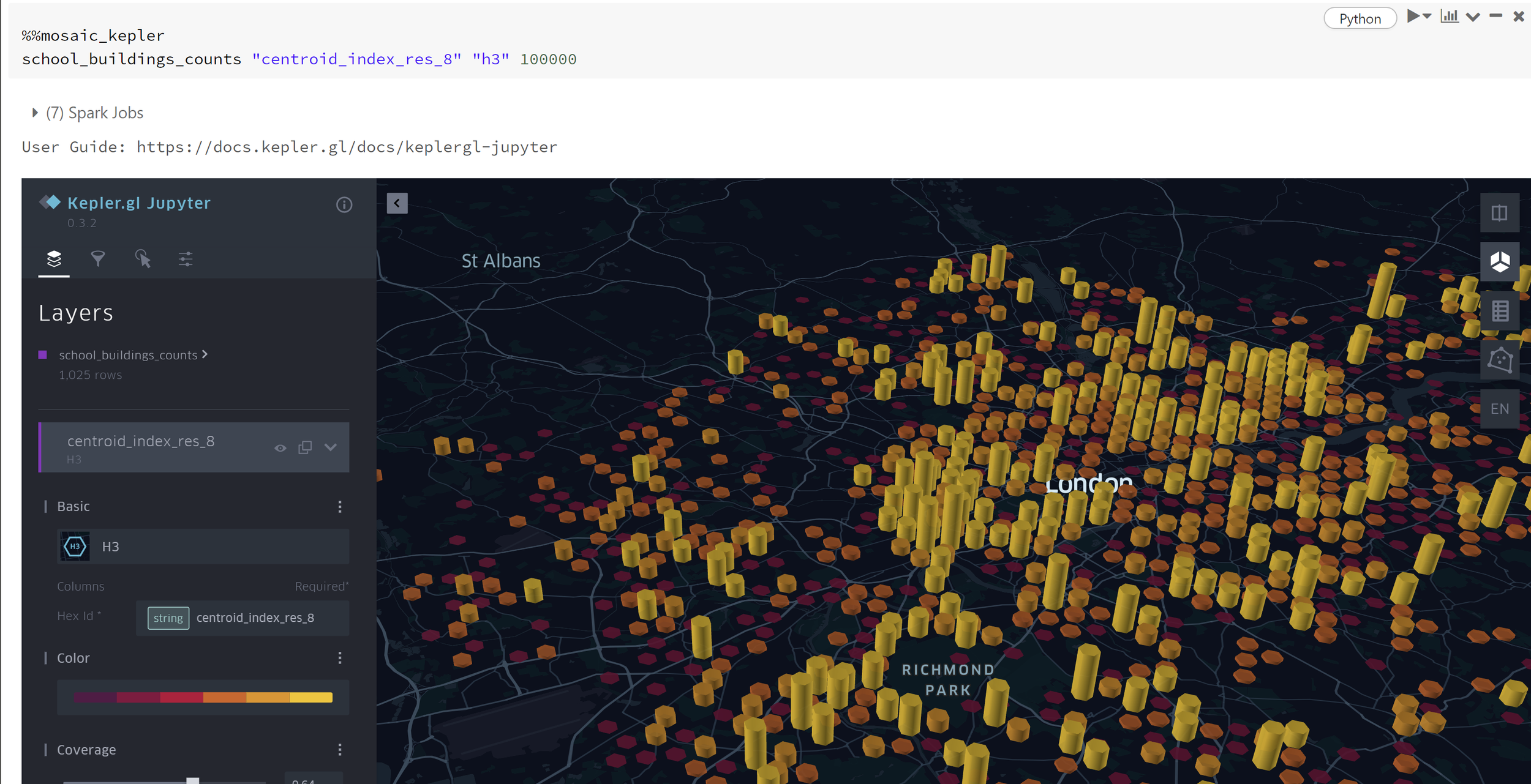
H3 index school density.
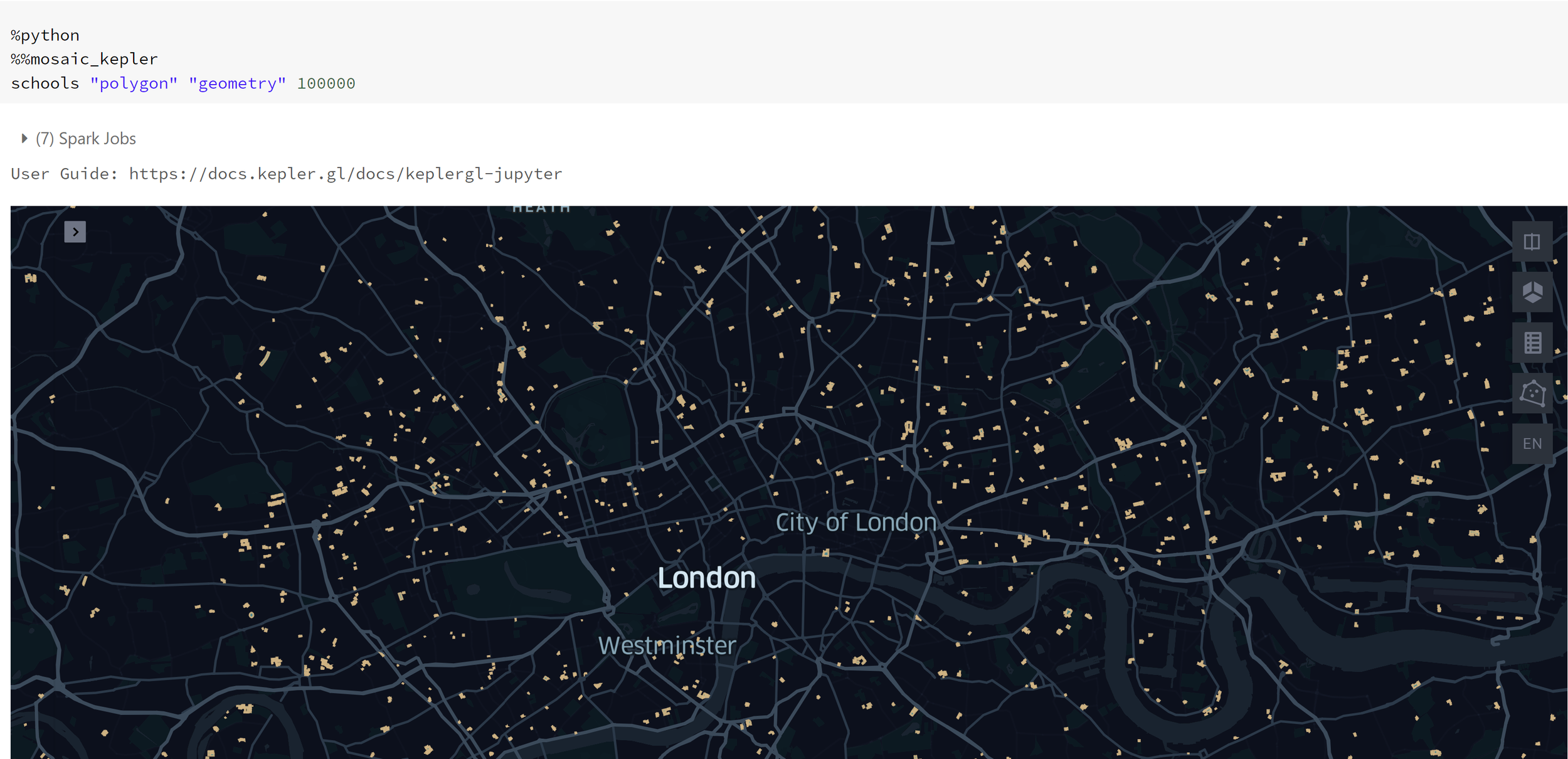
School geometries plotted.
The details of this example are taken from the Databricks solution example given in this link.
Routing
Companies relying on deliveries or pickups are faced with the old-age task of routine effectively across whatever region they serve. For this, there are two key components that need to be addressed: The calculated road distance between each node of a network (probably a shop or factory in a lot of cases) and a means of minimising a chosen metric across the network (normally travel distance or travel time). There are many ways of obtaining these two aspects for routing. Here is one example of obtaining both.
The first part is to find a method of calculating road distance between two points. There are two main methods for doing this. The first one is using the google distance API. This is an accurate means of calculating the distance between two points that takes into account traffic and time of day. It does, however, come at a cost. Although it isn’t expensive for a handful API calls, it can become expensive when the calls need to be in the 1000s (which is quite often the case with routing). Here is a link to the pricing available for the Google API method. The free alternative is to use OpenStreetMap data. This data doesn’t take into account current traffic, however, it is sufficient for many routing problems. OpenStreetMap doesn’t explicitly provide an API for routing. You have to generate road distance calculations using the data. There are a few methods for doing this. One of the most efficient ways is to use Open Source Routing Machine (OSRM) project. This can be setup on a Databricks cluster and used as a backend server. An init script is used when starting up a cluster. The details on setting this up are provided here. Once the server backend is setup on the cluster, the following can be used to test the server works on the cluster.
The command above obtains the IP addresses associated with the cluster and the command below tests the server, to see if it returns the appropriate response.
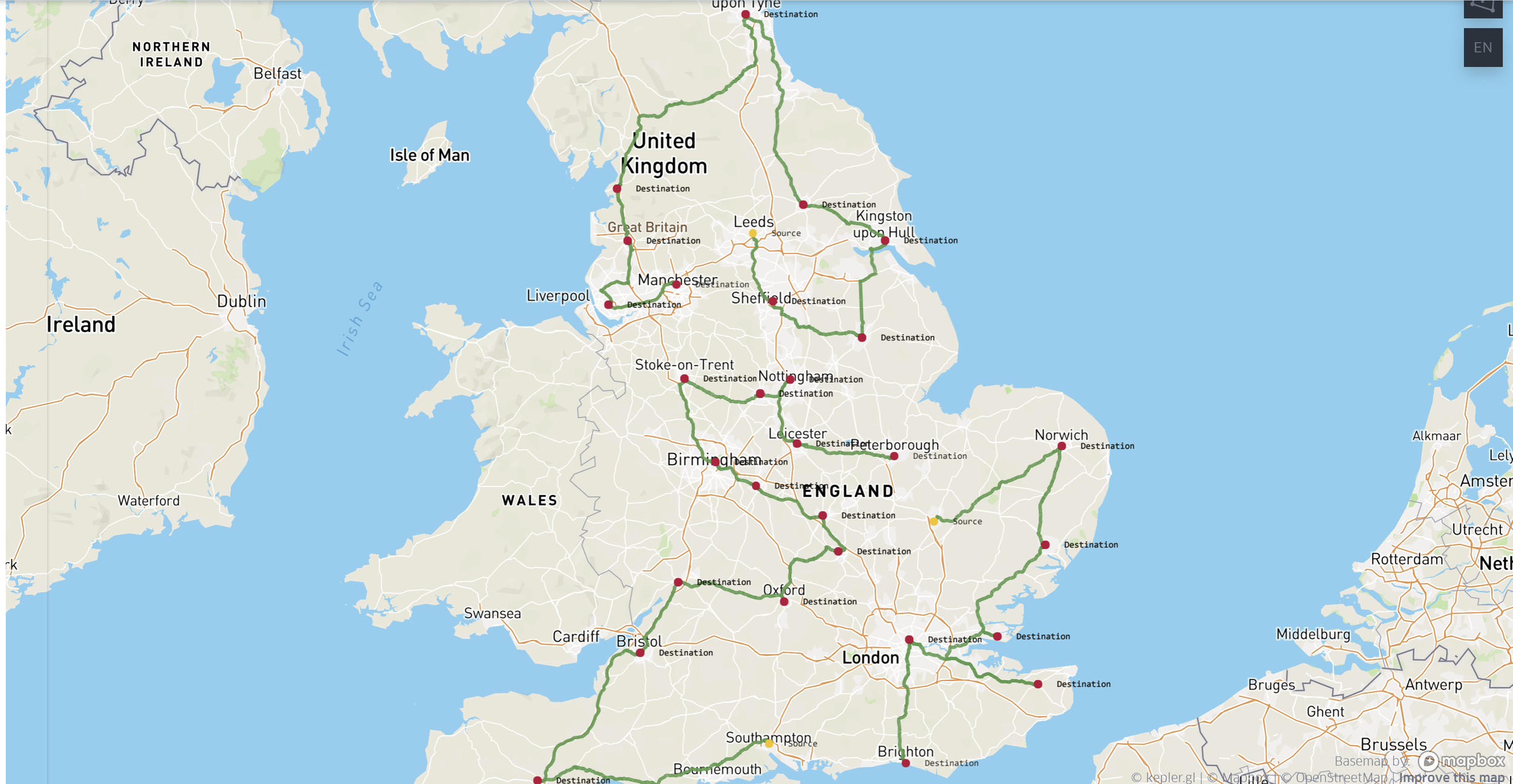
Next, consider the scenario where there is a company that has three distribution sources (marked in red) and these sources have to deliver a product to the destinations mapped all across the UK (marked in blue).
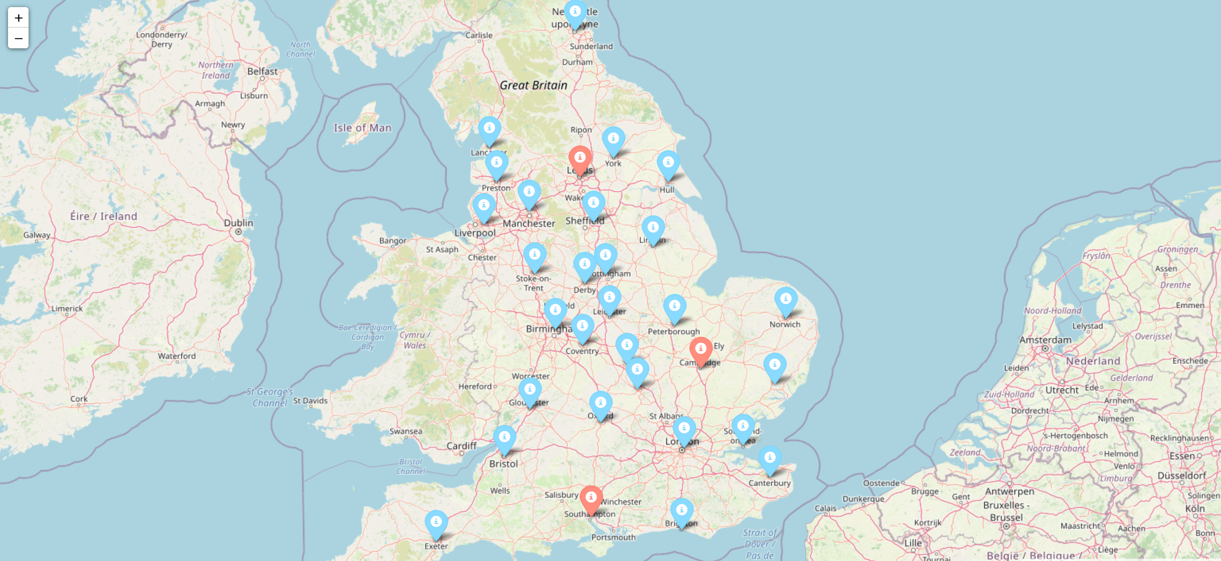
The producer wants to make sure they deliver to all of these outlets whilst minimising the amount of distance covered on the road by the vehicles. Many techniques have been proposed for achieving this. One of the most popular is linear programming. There are a number of libraries to choose from to do this. This example used the Python library PuLP. The idea is to generate a distance matrix using the method described above, and then use this within the optimisation algorithm to get the best route suited to this scenario.
Now the method has been mapped out, the next starting step is to generate a PySpark Dataframe containing all the potential routes for the nodes on the map. In this case, we label the start and end of each route as ‘a’ and ‘b’. The accompanying longitude and latitude coordinates are provided as well.
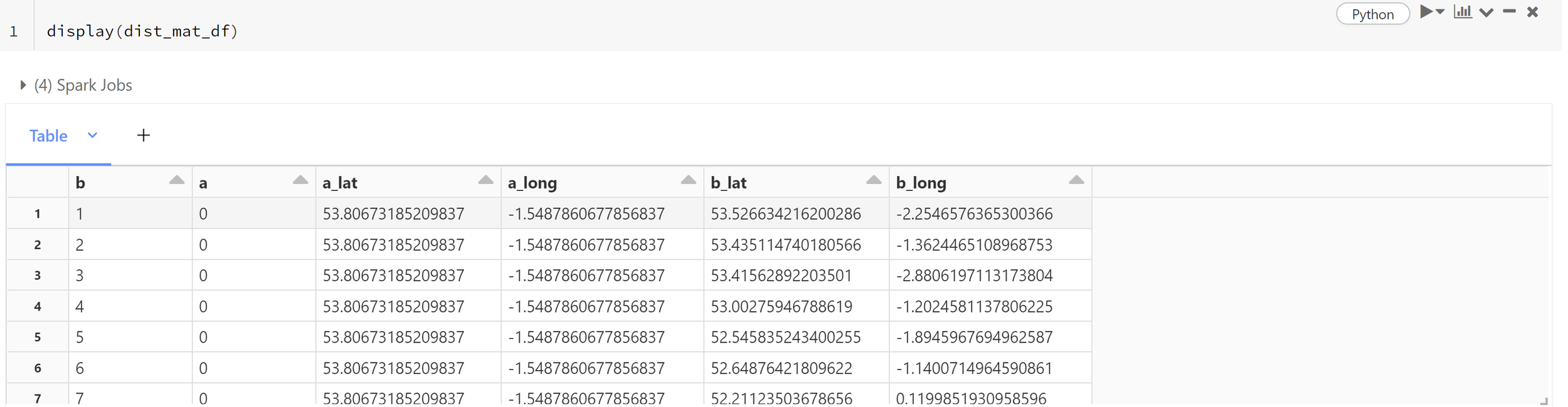
Following this, a Pandas user-defined function (udf) needs to be defined. The Pandas UDF is responsible for passing the coordinates from points ‘a’ and ‘b’ to the backend server (setup previously) and returning the route output. The output can then be used to generate a distance matrix.
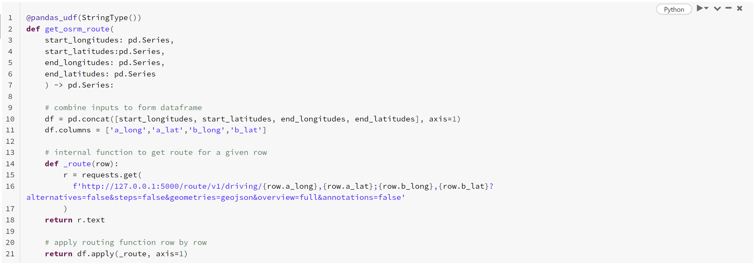
This Pandas UDF can now be used on the PySpark Dataframe to acquire the route information connecting each node. This is done using the command below
dist_mat_df
 .withColumn(
 ‘osrm_route’,
 get_osrm_route(‘a_long’,’a_lat’,’b_long’,’b_lat’)
 )
This now returns the output from the server, determining the connecting routes between the nodes. It is currently returning strings, which cannot be used for anything as it stands. This needs to be converted. This can be done using the from_json PySpark function. The schema of the output is as follows:
# schema for the json document
response_schema = '''
  STRUCT<
    code: STRING,
    routes:
      ARRAY<
        STRUCT<
          distance: DOUBLE,
          duration: DOUBLE,
          geometry: STRUCT<
            coordinates: ARRAY<ARRAY<DOUBLE>>,
            type: STRING
            >,
          legs: ARRAY<
            STRUCT<
              distance: DOUBLE,
              duration: DOUBLE,
              steps: ARRAY<STRING>,
              summary: STRING,
              weight: DOUBLE
              >
            >,
          weight: DOUBLE,
          weight_name: STRING
          >
        >,
      waypoints: ARRAY<
        STRUCT<
          distance: DOUBLE,
          hint: STRING,
          location: ARRAY<DOUBLE>,
          name: STRING
          >
        >
      >
  '''
This schema can be used along with ‘from_json’ to extract the actual data from each entry. From this, the GeoJSON can be extracted. Although the geometry is extracted, it isn’t in a form that can be plotted in Kepler. For this, it needs to be in a form like Well-known Binary. This is where Mosaic comes in handy. The command ‘st_wkb’ can be used to convert to WKB. This now provides the ability to plot the routes. The distance and times can also be extracted from the data. In order for the mosaic library to work within Databricks, the following needs to be done.
import mosaic as mosmos.enable_mosaic(spark, dbutils)This will allow you to use ‘st_wkb’ in the step below.
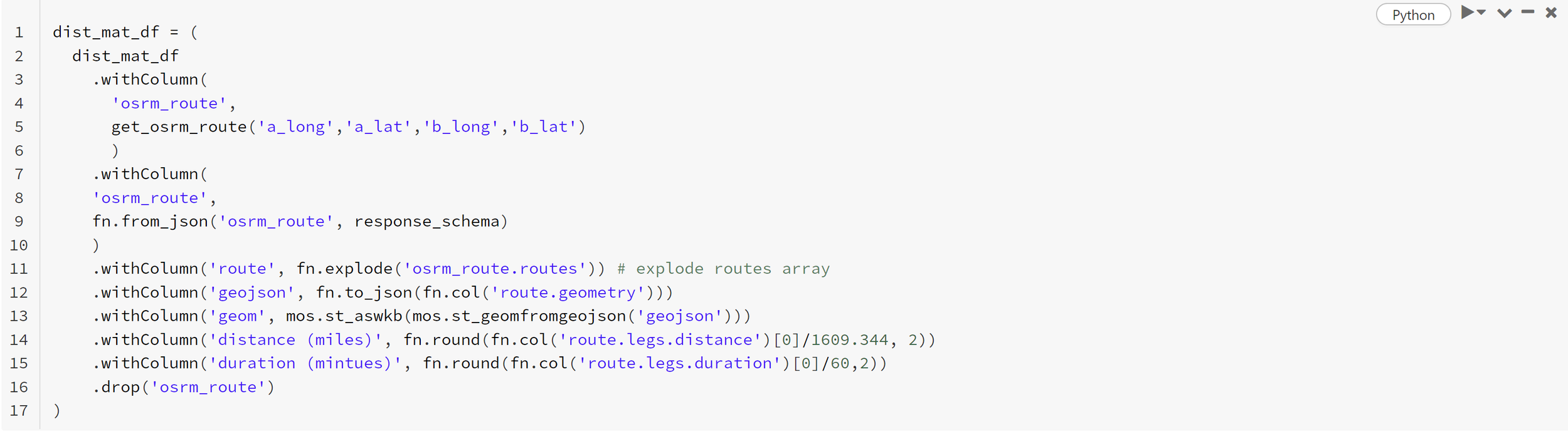
This now contains the data to generate the distance matrix and plot the routes. The matrix can be populated by duration or distance but in this example, it has used distance.
The distance matrix is a 2d numpy array that is used for routing optimisation. It can be generated using the following command.
mat_1d = dist_mat_df.select('a', 'b', 'a_lat', 'a_long', 'b_lat', 'b_long', 'distance (miles)').toPandas()
distance_matrix = mat_1d.pivot(index='a', columns='b', values='distance (miles)').fillna(0).values
The next stage of the routing process is to introduce PuLP. The following routines are required from the library.
from pulp import LpProblem, LpVariable, LpMinimize, lpSum, valueThe aim is to setup a binary variable space that can be used with the distance matrix to create the objective function.
obj = []problem = LpProblem("shortest_route", LpMinimize)route = LpVariable.dicts("route", ((i, j) for i in range(length)
for j in range(length)),
cat='Binary')
for j in range(length):
for i in range(length):
obj += distance_matrix[i][j] * route[i, j]#set objective
problem += lpSum(obj), 'network_obj'Following this, a series of constraints need to be added to the problem to mould it into the desired objective to solve. Things such as not allowing a route to be selected where it goes from ‘a’ to ‘a’ (essentially it doesn’t move) need to be considered. There also needs to be constraints that ensure the starting points are the sources and that there is a closed network (no breaks in the routes).
Once that’s setup, the command below will execute the solver.
problem.solve()The routes can then be retrieved from the variable ‘routes’. Joining the coordinates and the geom entry extracted from the server to a Dataframe containing the solution allows for the solution to be plotted. Using Mosaic’s inbuilt integration into Kepler, the solution can be visualised using:
%%mosaic_keplerroutes geom geometry 5000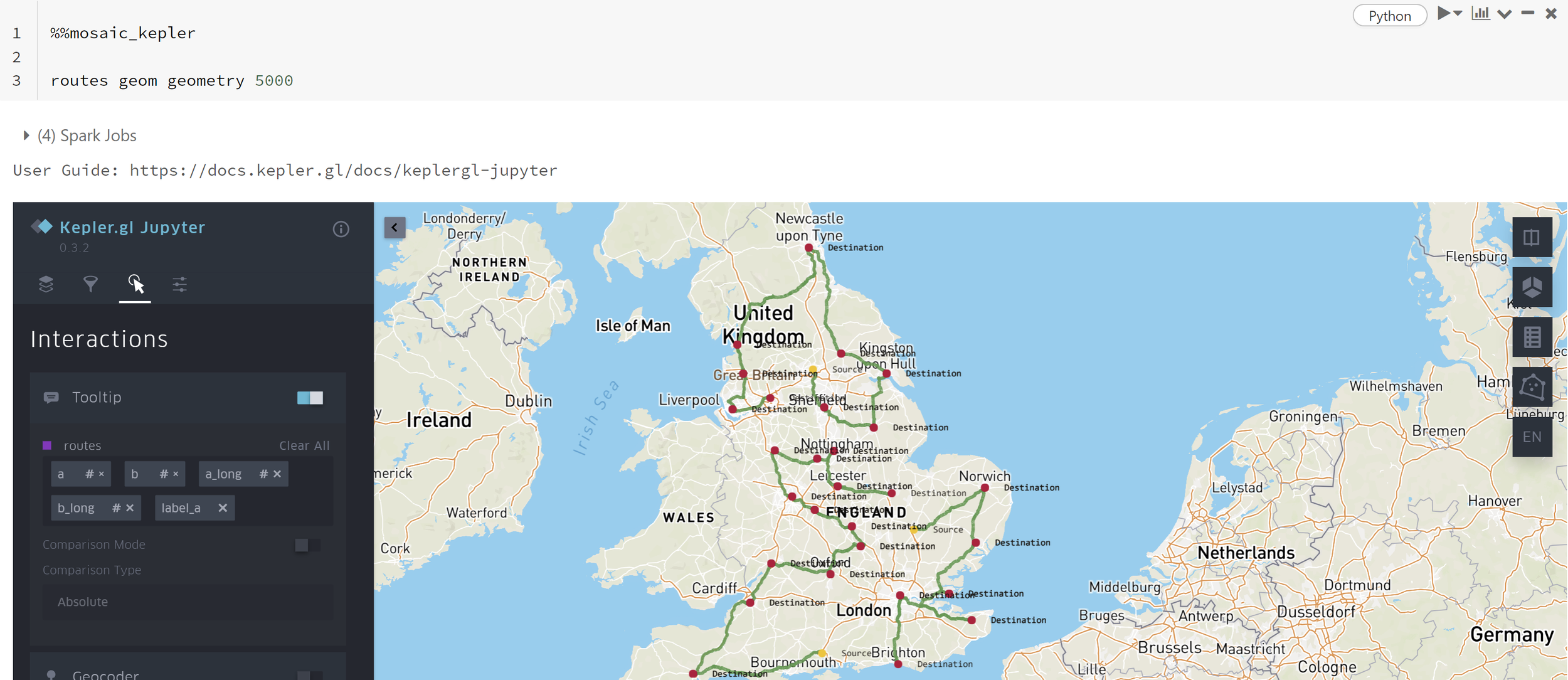
Conclusion
As demonstrated, Mosaic can be used to deliver many GIS use cases at scale. With the library only in its infancy, more offerings and features are on the horizon. Recently Mosaic 3.5 was released with the hint that more versions are soon to follow. More information is available within the following links for anyone wishing to get to grips further with Mosaic. Hopefully, this has given a taster of Mosaic’s capabilities.
Links for further reading:
High Scale Geospatial Processing With Mosaic From Databricks Labs — The Databricks Blog
How Thasos Optimized and Scaled Geospatial Workloads with Mosaic on Databricks — The Databricks Blog
I would like to say a big thank you to Milos Colic for the help and advice he provided with this article.