

How to explain your machine learning model using SHAP?
Written by Dan Lantos, Ayodeji Ogunlami and Gavita Regunath
TL;DR
SHAP values are a convenient, (mostly) model-agnostic method of explaining a model’s output, or a feature’s impact on a model’s output. Not only do they provide a uniform approach to explaining behaviour, but they can help developers get better insight into why their models do(n’t) work.
Your model is explainable with SHAP
Machine learning is a rapidly advancing field, with many models today utilising disparate data sources, consuming outputs from other models, involving increasingly large feature inputs - all of these lead to highly complex “black-box” solutions, which are typically difficult (approaching impossible) to explain.
As people continue to research and develop different machine learning algorithms and libraries, a lot of the fine-grained detail can be lost. Many packages today allow for model defining, fitting, hyperparameter tuning and predicting in just a few lines of code, being “removed” from part of the creation process allows people to utilise models far more complex than previously. However, this can lead to a situation in which even the creators of the model may struggle to understand the “logic” behind their model. This lack of interpretability and explainability is a huge challenge when there is a need to explain the rationale behind a model’s output.

What does Interpretability and Explainability in machine learning mean?
Interpretability has to do with how accurately a machine learning model can associate a cause (input) to an effect (output).
Explainability on the other hand is the extent to which the internal mechanics of a machine or deep learning system can be explained in human terms. Or to put it simply, explainability is the ability to explain what is happening.
Let’s consider a simple example illustrated below where the goal of the machine learning model is to classify an animal into its respective groups. We use an image of a butterfly as input into the machine learning model. The model would classify the butterfly as either an insect, mammal, fish, reptile or bird. Typically, most complex machine learning models would provide a classification without explaining how the features contributed to the result. However, using tools that help with explainability, we can overcome this limitation. We can then understand what particular features of the butterfly contributed to it being classified as an insect. Since the butterfly has six legs, it is thus classified as an insect.
Being able to provide a rationale behind a model’s prediction would give the users (and the developers) confidence about the validity of the model’s decision.

Figure 1: Black-box model vs. explainable model
As complex models are deployed in more environments, the need for regulation occurs. In areas such as medicine, insurance and finance, decision-making processes (e.g. insurance claims acceptance/rejection) need to be fair (am I being treated equally?) and transparent (how did you end up at that decision?). Tools such as SHAP can help ensure that these requirements are met.
What is SHAP?
SHAP is an approach based on a game theory to explain the output of machine learning models. It provides a means to estimate and demonstrate how each feature’s contribution influence the model. SHAP values are calculated for each feature, for each value present, and approximate the contribution towards the output given by that data point. It’s worth noting, that the same values of a feature can contribute different amounts towards an output, depending on the other feature values for that row.
This method approximates the individual contribution of each feature, for each row of data. It approximates the contribution of that feature by estimating the model output without using it versus all the models that do include it. As this is applied to each row of data in our training set, we can use this to observe both granular (row-level) and higher-level behaviours of certain features.
How to use Shap?
Below is a short example of implementing SHAP in pyspark. We acquired FTSE100 index data from yfinance, and wrangled our dataset to include the “close” as our target variable, and included the prior 2 days’ open/high/low/close/volume values as our features. We run an untuned random forest to predict the “close” value, and call the SHAP package to explain our model’s behaviour.
Once we’ve fitted our model, and defined our SHAP method, we just need to use the below line to generate our first plot.
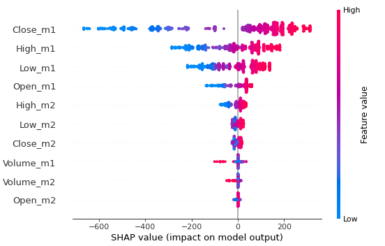
Figure 2: SHAP summary plot.
The plot above represents every data point in our dataset. It plots a single SHAP value (x-axis) for every data point in our dataset. Each “row” (y-axis) of the chart points to the feature on the left-hand-side, and is coloured proportionally based on the feature value - high values for that feature are red, and low values for that feature are blue. Values further to the right are having a “positive” impact on the output, and values further to the left are having a “negative” impact on the output. Positive and negative here are simply direction terms, and relate to the direction in which the model’s output is affected, this has no indication on performance.
As an example, the furthest left point for close_m1 is a low value for that feature, as it is coloured blue. This low value for close_m1 impacted the output of the model by approximately a flat -700. In essence, the model without that feature, would have predicted a value o 700 higher.
The graph allows us to visualise the impact not only of the feature, but how that feature’s impact varies over lower/higher values. The top 4 features shown there are our open/high/low/close features for yesterday (_m1, _m2 is 2 days ago) and exhibit negative impacts for low values, and positive impacts for high values. This is not a huge revelation, but allows us to clearly see this behaviour.
Using the next two lines produces a plot for each feature, but we’ve only included two below.

Figure 3: SHAP dependence plots.
The above graphs plot SHAP value for feature (y-axis) against value for feature (x-axis) and is coloured by some other feature. For the top chart, we can observe a simple linear trend, where lower values (of close_m1) have a negative impact on the output. The colouring also demonstrates a similar trend when comparing it to high_m1.
The second chart is a little more interesting. We can see that the feature volume_m1 typically has a small positive impact on the output, and some large values of volume_m1 have a much larger negative impact on the output. This points towards a more complex, and less sensitive relationship between this feature and our model.
These plots give a much more granular window into the model’s behaviour, the plot of volume_m1 indicates that a volume of ~1.5bn can impact the model from -100 up to -10. This type of varying behaviour for equal values requires this level of granularity to observe.
The final few lines of code produces the “force_plot” output from SHAP, where we can observe the impact each feature in a given row has on the model. Again, it produces multiple ouputs, but only two are shown below.

Figure 4: SHAP force_plot output.
The above graphs describe two different rows of data in our dataset. The “base value” is the mean for the output, which is ~6950 in our case. This is the baseline for predictions, and then the prediction is altered accordingly based on the value of each feature.
The top plot is being entirely pushed in a positive direction, with the base of 6950 being pushed up to 7315.15. As the labels are ordered by impact, we can directly read the highest impact being our “close_m1” feature, which had a value of 7248.4. If we refer back to the dependence plots generated beforehand, we could verify that a close_m1 value of 7248.4 roughly translates to a +180 impact.
The bottom plot tells a similar story, mainly in the other direction, with low values pushing the prediction lower. While these plots do demonstrate the functionality of the SHAP library, it is uncommon to see such “uniform” impacts.
Summary
As AI continues to grow and becomes more intrinsic in our lives, it is important to explain model predictions. When we started this article, our motivation was to introduce Explainable AI and drive the use of explainability in machine learning models. Hopefully, we have highlighted how SHAP can be used as an effective technique to explain model predictions to support decision-making processes and emphasise the motivation behind its use.
References
Lundberg SM, Lee SI (2017), “A Unified Approach to Interpreting Model Predictions”, Neural Information Processing Systems (NIPS) 2017