
Microsoft Fabric: An End to End Implementation
This blog will walk you through the entire data lifecycle of ingesting data from SharePoint and Azure Blob Storage, through the lakehouse pattern, and finally to the reporting stage - all using Microsoft Fabric.
As we’re well into summer now, festivals can be a great way of spending time with friends and family. But all too often, we each want to see various acts and activities. How can we make this easier? With this dataset I created, it takes a simple Excel / CSV file with acts, stages, who wants to see this, and a personal rating. We will run this through the lakehouse pattern and finish with a curated/gold layer which can be used for reporting directly on top of. For more information on lake layers, you can see Ed's blog Medallion Architecture: What is it?. So, you can highlight those clashes and keep everyone happy during your festival fun!
The Dataset
The data comprises two tables in an Excel file. The first is the ‘acts to see’. Here we have a list of each act, the stage name, the date, and the time of the performance as well as who added the artist. This is followed by a column rating system for each member of the group attending.

Acts to see Table
Lastly, we have a StageArea table which contains location information of the stages. This was included to demonstrate joining within Fabric.
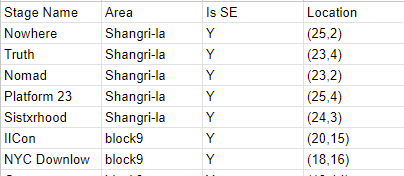
StageArea Table
As this is a walkthrough / demonstration of the tool, I will upload this Excel file in two methods.
The first is to connect through SharePoint as it is.
The second, I will take the acts to see table and split this into its own CSV file and store this in Azure Blob Storage. This means you will be able to see how the ingestion may differ between the two.
Prerequisites
For the following walkthrough, I have created three empty lakehouses called: bronze_lakehouse, silver_lakehouse, and gold_lakehouse. This is to replicate the medallion architecture in which at each layer we will validate and then enrich our data. To do this, simply go to your workspace, click ‘new’ and then ‘lakehouse’.
Ingestion
The first step of any data implementation is ingesting the data into the platform. Within Fabric, this can be completed in the ‘Data Factory’ experience. Here we have access to Dataflow Gen2 and Data pipelines. Let’s explore Dataflow Gen2 to ingest our Excel file.
Dataflow
Upon creating a dataflow, we are presented with several data connectors by selecting ‘Get data’.
Empty Dataflow
After selecting Excel, you can enter your SharePoint details and link to where the file resides. You also have the option of using the OneDrive browser.
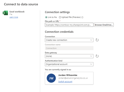
Connecting to a Data Source
After linking the file, you should see a list of all the sheets and tables the UI has managed to find; elect the ones that are needed to pull in to the model. For the purposes of this example, I will only be using the StageArea table. Once this is selected, you will be presented with a familiar set of tools from the power platform for data manipulation and validation.

Dataflow UI
Once you are happy with the data presented in the table, you can add the data destination. We will be selecting a lakehouse. In the UI, you will be presented with all the lakehouses that you have permission to view. I will be landing this data in my bronze_lakehouse.

Choosing a Destination Target
Now you are ready to publish your dataflow. By doing this, the dataflow will validate and then run if successful. If you navigate to your lakehouse, you should now see this data being populated.
Pipeline
For the second table, the acts to see, as mentioned earlier, I have created a CSV of this data, and it is being stored in Azure Blob Storage. For this reason, we can use one of two methods:
A pipeline with a copy job,
We can use a shortcut and access the file directly.
For completeness, I will be demonstrating a copy job within a data pipeline. For your own implementation, you should consider the benefits of both approaches and select the appropriate method for your use case.
Again, the UI and experience of a data pipeline should be very familiar if you’ve used data factory before. For this ingestion, we need a simple copy job task, with the source set to external and linked to your storage account, as shown below:
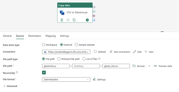
Pipeline Source (Copy Job)
The UI offers a preview data feature which you can use to ensure the connection details and file paths are correct. This is a basic example above, and your pipelines may look more dynamic in practice. And similarly to the previous example, we will load this into the bronze lakehouse in the destination.

Pipeline Destination (Lakehouse)
You have the option in the mapping section to define column types and column renames. To ensure no column dropouts and data loss, it’s best to keep this as strings for the bronze layer. In the pipeline UI, you can validate and then run this to load the data into the bronze layer.
Looking through the lakehouse explorer, you can validate that these loaded correctly. Once happy that the data has been ingested into the platform, it is time to move onto the next stage in the process.
Data Validation
Typically, when data is moving from the bronze to silver layer within a lakehouse architecture, we are ensuring that the data conforms to any data validation rules and schemas we may be expecting. Therefore, our efforts at this stage are to ensure that our data is cleaned and ready for any business logic that may need to be applied.
In Fabric, when dealing with the lakehouse experience, the bulk of our transformations will be completed in notebooks. Below is an example of this schema and column type definition. These will ensure that the data in the silver layer is of the types we expect.
Silver Transformations
After running this notebook, we can again verify in the lakehouse explorer that our data has loaded as expected. Then we are ready for the next stage, data transformations and business logic.
Data Transformations
Within Fabric’s notebooks, you as the data engineer have the selection of the programming languages PySpark (Python), Spark (Scala), Spark SQL, or R. These can be set at a notebook level, and if needed, individual cells can be defined in another language if needed. I will be using PySpark. For our final layer, we are curating the datasets which reports will be built on top of. This is therefore the section in which we must apply business logic and often can be the most time-consuming and hardest to define.
The specific PySpark commands are not that important below. Just be aware that you can import packages and display results directly from the notebook cells. To keep the screenshots at a reasonable size, I have just written the table down directly.
Gold Weighted List Table
It is also quite common for completely new tables to be made for the purposes of reporting. In the following screenshot, we can see that I am using the table defined from above to create a second table.

Curated Table Transformations
And finally for completeness here are the gold layer transformations for the StageArea table.
Gold Stage Table
If you’ve made it this far, congratulations, we’ve ingested our data from multiple sources. Taken the data through a full lifecycle of validation and transformations. And it is now in a state ready to be reported on. Which brings us to the final stage of the end-to-end Fabric implementation.
Datasets and Reporting
Now that our lakehouse contains our final curated tables we can use the 'New Power BI Dataset' option in the lakehouse explorer to start building our reporting model. It is a good idea to create a dataset to connect to in PowerBI as we can define the relationship between the tables and ensure any reports will keep these consistent.

New PowerBI Dataset
Once all the tables have been selected, you will be taken to the dataset page. Here is where you can define and create relationships between the tables and create any measures that need be available to any report connecting to this dataset. Note: In the top left of the screenshot below is the name of the dataset. Within Fabric, when you create a new dataset, it will default to the name of the lakehouse it is being built from. Please ensure to rename this to something meaningful. This will help keep your workspace clean, as well as assist any users trying to find these from within Power BI.

Dataset Web UI
Now it is time to create a report over your data. This can either be done directly in the web portal by pressing ‘New report’ from the ribbon. Or by connecting to your dataset from PowerBI desktop. I will be doing the latter.
From within PowerBI, if you connect via the Data Hub, you will see all your published datasets. You will see that all your lakehouses are also there. This is because when you create a lakehouse, a default dataset is created. It is advised that you do not report directly on top of these and instead create a dataset for each use case to ensure best practices.

Data Hub in PBI
Once you’ve connected to the dataset that is it. You are now able to create any reports required! Mine below is by no means the state of the art of PowerBI dashboards, but by using the relationships between the tables it offers drill down functionality to help identify those clashes and allow you and your friends to enjoy your festivals to the fullest!

Screenshot taken from PoweBI Desktop
Finally, if we refresh the data, we see that we are connected to the data using DirectQuery. This shows we are reporting against the underlying tables directly and boasts impressive refresh times. As well as reflecting any changes immediately. No waiting for a scheduled dataflow refresh, or external processes. If the data changes your report will change as well.

Refreshing Data with DirectQuery
Conclusion
In this blog post, we looked at taking data from various sources, validating schema and data types, then curating a reporting layer through the lakehouse medallion architecture. Finally, once the data had been transformed, a data model was created, and a PowerBI report was created. This simple example offers an end-to-end solution which you may face in your organisations. If you’re struggling with a Fabric deployment or want to know more about the best practices, our Fabric Proof of Concept may be of interest to you. The 4-week engagement helps you better understand how Fabric can work as a unified data solution across various use cases specific to your organisation. Find out more here.