Visualize and manage all of your services in one place with Dynamic Service Graph
In this digital era, technology systems are becoming increasingly complex. No longer can a single SME (subject matter expert) understand every facet of the system they run. Instead, much of this knowledge is siloed and exists as tribal knowledge within certain teams. Additionally, the rate of change is faster than ever, with code deploying and new services shipping at a rate unimaginable a few years ago.
The majority of our customers tell us that they’re dealing with this enormous rise in complexity by adopting a service ownership approach to create a holistic view of a system and democratize knowledge between all technical and business teams. Adopting this model takes an organization-wide effort, and, like all cultural changes, will never truly be “done.” Thankfully, PagerDuty can help teams on their service ownership journey, whatever that stage might be.
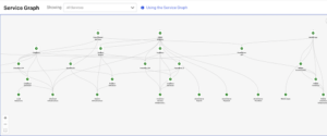
We are excited to announce the general availability of PagerDuty’s Dynamic Service Graph. This feature enables organizations to have a holistic view of all their technical and business services and dependencies, bringing the entire service topology into a single view to be used by all teams in real-time.
Introducing Dynamic Service Graph
Dynamic Service Graph democratizes knowledge across the entire organization about how services work together to deliver customer-facing capabilities, and visually represents the health of those services. This helps teams better understand the health of the overall system, not just the components they’re individually responsible for. It also improves incident response as teams can better determine where an incident is occurring as well as the potential upstream and downstream effects of the issue.
Understand how services connect to deliver business capabilities
Technology ecosystems have hundreds or thousands of moving pieces. Other line-of-business stakeholders might find it difficult to understand how these interconnected pieces make up the business services they’re responsible for. Yet, it’s critical that all teams are able to communicate effectively with each other to resolve problems and bridge any gaps in understanding.
With Dynamic Service Graph, it’s easier than ever to visualize how each service is connected to another, and how they build up into larger business services that have direct impact on critical business capabilities. This interconnectedness removes siloes and encourages knowledge sharing.
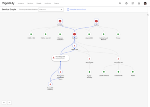
Understand affected services during an incident
Technical teams often receive alerts that their service is experiencing an issue. Yet, sometimes their service isn’t the true culprit. If the service is dependent on another service which is experiencing an issue, there might be little they can do to fix the problem themselves. But, if teams are in the dark as to what services are affected, they could be wasting precious time investigating the source of the problem.
On the flip side, when an incident occurs, a team facing an issue with their service might lack the information to triage accurately. If the team doesn’t understand the downstream effects of the issue with their service, it could cause outsized negative impact.
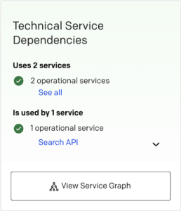
Dynamic Service Graph allows teams to examine services and identify what’s affected by failure and why. From both the incident details page and the service graph, teams can quickly see a service’s impact on the rest of the system.
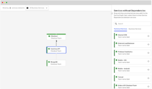
Identify services missing dependencies to understand gaps
Whether an organization is well into its service ownership journey or just getting started, it’s likely that some information on the system structure is incomplete. This is due to increased silos as teams grow, and tribal knowledge that’s passed on through teams but rarely documented or shared. And, it’s exacerbated by the rapid pace of change within the systems, with code pushing multiple times per day and new services changing underlying relationships.
Dynamic Service Graph helps encourage teams to maintain up-to-date dependencies because that control is in the hands of the people operating the services, making the on-call experience easier for everyone carrying the metaphorical pager. When mapping services, PagerDuty will offer suggestions as to which services currently lack dependencies. From there, you can drag and drop relevant services into your graph, creating a more comprehensive view of the system with each click.
Ready to try for yourself?
With PagerDuty’s Dynamic Service Graph, your technical teams will have the ability to view and dynamically map clearly defined services and streamline incident response to reduce downtime and customer impact. This will help teams make the most of their service ownership model and spend less time firefighting and more time innovating for their customers.
“Service Graph has driven us to shift focus from a technical service dependency strategy to a business service based strategy to more effectively identify impact to our end users. Using the new service graph functionality, our support teams are able to visually assess impact at a glance, which enables them to more quickly and accurately determine root cause. The feature has given our service owners the visibility into their dependencies which were previously only in documentation.” —Senior Manager, Gaming Industry
If you want to learn more, check out our recent webinar, Services Like a Boss: Best Practices for Implementing and Maintaining Services Architecture, read our knowledge base article here, or view our documentation here.
If you’re ready to see Dynamic Service Graph in action, try PagerDuty for free for 14 days.